

Lead generation
11. August 2026
50+ CTA ideas for B2B that boost your conversion rate
You do not increase your conversion rate by using the same (poor) call to action in multiple places. You increase it by giving your visitors more things to convert to. So do not plaster your site with “Contact us”. Here is some inspiration for what you can do instead.
Content
Go to the list Who is the list for? Types of conversions How to use the list How to choose the right onesYou need to take CTAs seriously!
Let us be honest: coming up with good calls to action is something most people leave until the very end. In my experience, every company talks about “good calls to action”, but when you hear what they mean by a “good call to action”, it is a contact form—so the customer can get in direct touch with the company’s sales team.
Yes—and that is the best call to action FOR YOU. That is very much inside-out thinking. Wanting potential customers to get in touch and buy. But what if they do not quite feel ready to buy? Talking to a salesperson does not feel no-strings-attached, because we are using another person’s time.
The problem with not developing different hooks and conversion points (CTAs) is that it is often the last thing a potential customer sees before deciding to act—or close the tab. It deserves more than five minutes of thought.
I have put together a long list of suggestions for what you can offer your visitors—everything you can use to improve your conversion rate.
Who this list is for
The list is built specifically for B2B—where decisions are rarely made on impulse, where several people often need to be convinced, and where the “buy now” feeling from webshops rarely works.
In addition, several of these CTAs require a professional sales organisation and someone to handle your marketing.
How to use the list
CTAs are not just button text. They are the entire movement that takes a visitor from “curious” to “taking action”. That is why we have split the list into five categories, depending on what you are trying to achieve:
- Visual aids – because words alone do not do the job
- Wording in your form – the actual button text for hard conversions
- Soft conversions to content – for those who are not ready to talk to a salesperson yet
- Navigation to converting content – that guides visitors further on the site
- Interactive elements – that give something back to the visitor immediately
Soft vs. hard conversions
It is important to distinguish between soft and hard conversions. A good B2B website includes both, to accommodate different companies at different stages of their decision-making process.
The simple difference is: Hard conversions are handled by sales, and soft conversions are handled by marketing.
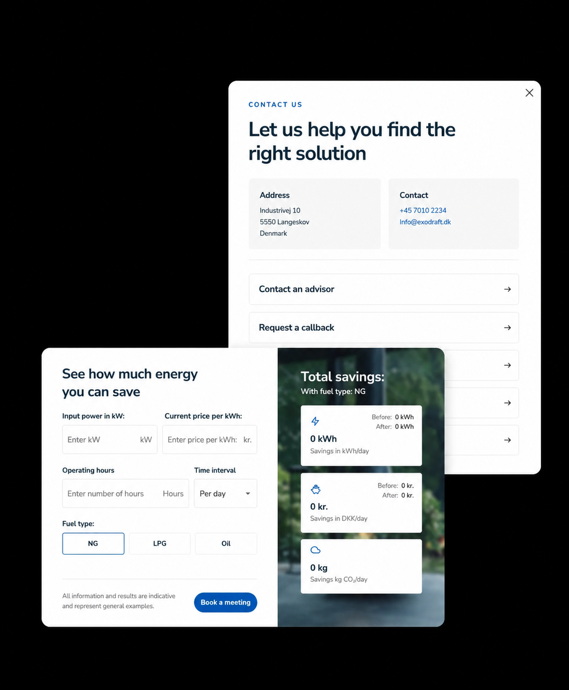
Hard conversions
When the customer gets in touch, requests, buys, etc. In sales terms, these are all conversion actions that generate ‘Sales Qualified Leads’ (SQL)—leads that must be handled by sales or a salesperson.
These can be conversion actions such as:
- Contact form
- Phone calls or emails
- “Get a quote”
- “Book a demo”
- “Get a free audit”
But many companies misunderstand this and think, “We want lots of sales-ready leads, so we will add lots of contact CTAs—then more people will get in touch.”
But this does NOT generate more leads
Soft conversions
These are conversion points that generate leads that need further nurturing through content and campaigns—so-called MQLs (Marketing Qualified Leads).
These are conversion points that speak to the user who is not quite ready to make a decision or talk to a potential supplier.
These can be conversion actions such as:
- Newsletter sign-up
- Webinar sign-up
- Download material (whitepapers, case studies, analyses, etc.)
- Reading a case study
- Visiting relevant content (e.g., cases, team pages, product pages, etc.)
Any self-respecting B2B company should work on collecting soft conversions, so you can nurture more potential customers and generate more relevant SQLs later on.
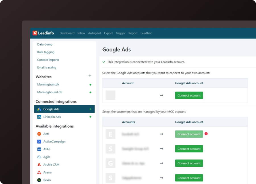
An important tool for this is LeadInfo, where you can see which companies take which actions on your website.
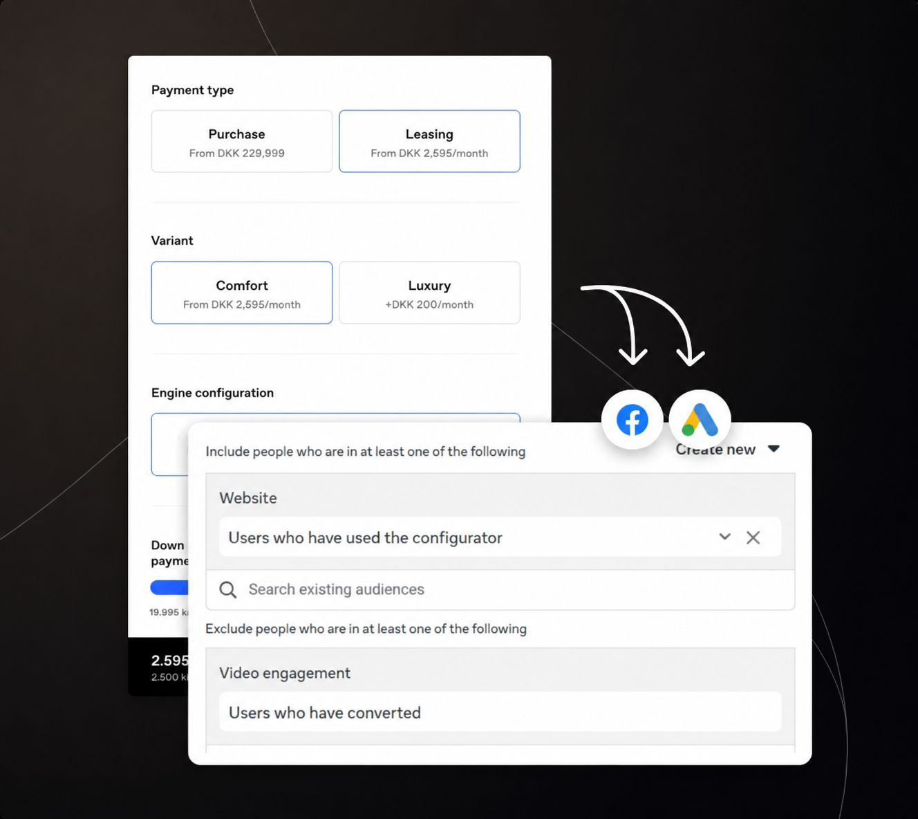
LeadInfo has a smart feature that lets you set up marketing campaigns on, for example, LinkedIn, Meta, and email platforms, which are automatically targeted at stakeholders in companies that have shown very high-intent behaviour on your website.
That way, you can further market to the companies that show interest but have not yet reached out.
The list of 50+ CTA optimisation ideas
Category 1. Wording in your form
These are the “hard” CTAs—the ones that lead directly to contact or sales. In B2B, the threshold for clicking is often high, so the wording matters a lot in terms of how much friction you can remove in the button text alone.
For meetings and sales calls
- “Book a meeting”
- “Book a free call”
- “Book a no-obligation chat”
- “Put a meeting in the calendar”
- “Talk to a specialist”
- “Talk to an expert”
- “Get a personal walkthrough”
- “Book a demo”
- “See a live demo”
For input and advice
- “Get free input”
- “Get a no-obligation quote”
- “Get a free check of your [website/process/data]”
- “Get a second opinion”
- “Book a strategy call”
For pricing and quotes
- “Get a quote”
- “Get a quote”
- “Calculate your price”
- “View pricing”
- “Request a quote”
For a softer contact
- “Write to us”
- “Let us have a chat”
- “Contact our team”
- “Ask us your question”
Mostly for SaaS companies
- “Let us get started”
- “Get started today”
- “Start your free trial”
- “Become a customer”
- “Try it free for X days”
Rule of thumb: The earlier in the customer journey, the softer the language. “Book a no-obligation chat” typically converts better on the homepage than “Become a customer now”, simply because it matches how ready the visitor actually is to decide.
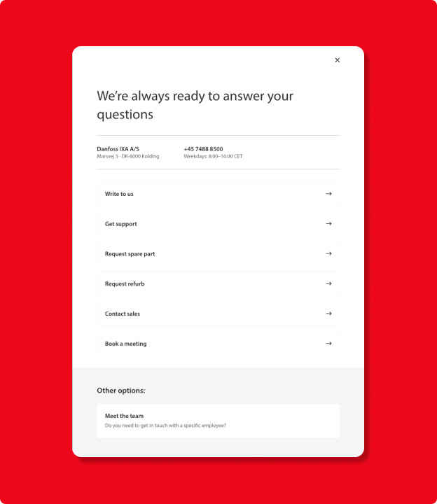
Category 2. Soft conversions to content
Not everyone is ready to talk to a salesperson. Some just want to learn more first—and that is perfectly fine. Here are CTAs that provide value without requiring a meeting in the calendar.
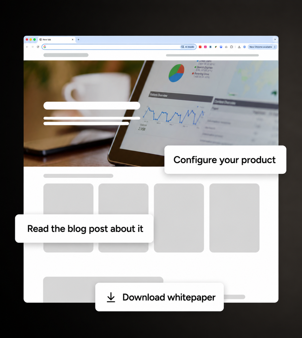
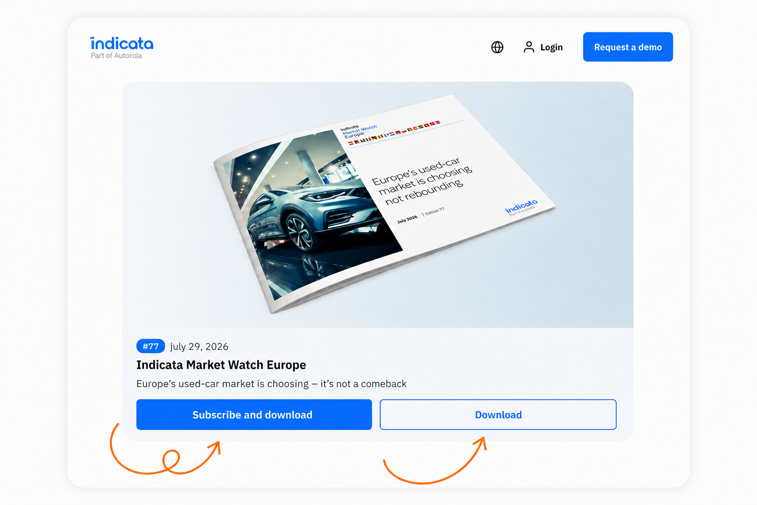
- “Download whitepaper”
- “Download the guide”
- “View the analysis”
- “Download the report”
- “Watch the video case”
- “See how [customer X] solved [problem Y]”
- “Download checklist”
- “Download template”
- “Watch the webinar on demand”
- “Sign up for the next webinar”
- “Download the e-book”
- “Get access to the report”
- “See benchmark data for your industry”
- “Download the industry 2025 report”
- “See the recipe/framework behind [method]”
These CTAs are gold at the top of the funnel. They do not require anyone to commit to anything—just to be curious enough to click. And for every download or view, you get a lead you can nurture further with marketing automation or follow-up emails.
Category 3. Navigation to converting content
Sometimes the best CTA is not a conversion at all—it is an invitation to explore further. This is especially true in B2B, where decision-makers often research thoroughly before they even consider filling out a form.
- View cases
- See our customer cases
- Find the right product for you
- See how we work
- Read more about us
- See our process
- Meet the team
- See references
- See what our customers say
- Explore solutions
- Compare solutions
- See which package fits you
- See results from similar companies
These work especially well as secondary CTAs alongside a primary “hard” CTA. The visitor who is not ready to book a meeting yet gets somewhere to go instead of simply leaving the page.
Category 4. Interactive elements
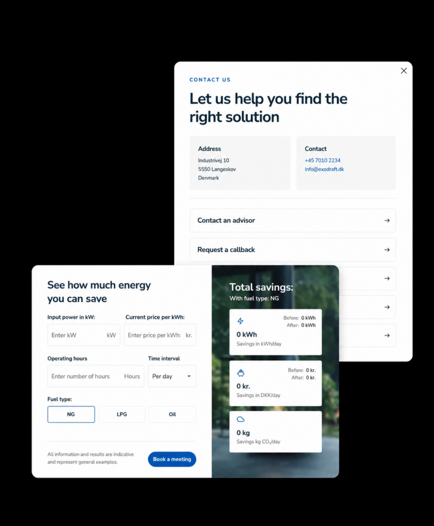
These CTAs do not just ask for a click—they give something back immediately. And in B2B, where decisions often require an internal “business case”, a concrete number from a calculator can be what moves the case forward internally.
- Pricing calculator
- ROI calculator
- “How much can you save?” calculator
- Risk assessment
- Maturity test (“How digital is your company?” or the example below “Are you ahead or behind on AI?”)
Is AI a permanent item on the management agenda?
- Quiz: “Which solution fits you?”
- Tailored recommendation based on your answers
- Self-service configurator
- Benchmark yourself against the industry
- “Check your website/SEO/security—completely free”
- Interactive business case generator
- Savings calculator
The advantage of interactive CTAs is that they rarely feel like “marketing”. They feel like a tool. And a tool that gives the visitor a concrete, personal result is far harder to ignore than yet another “Contact us” button.
Category 5. Visual aids for CTAs
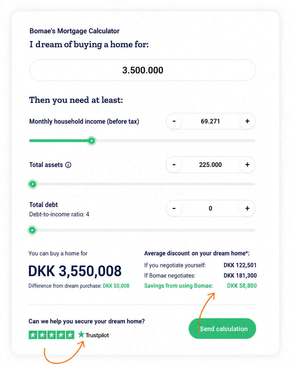
Perfect copy does not help much if the button gets lost in the rest of the page. The visuals are often what determines whether the CTA is even seen before anyone gets around to reading the text on it.
- A contrasting button colour relative to the background
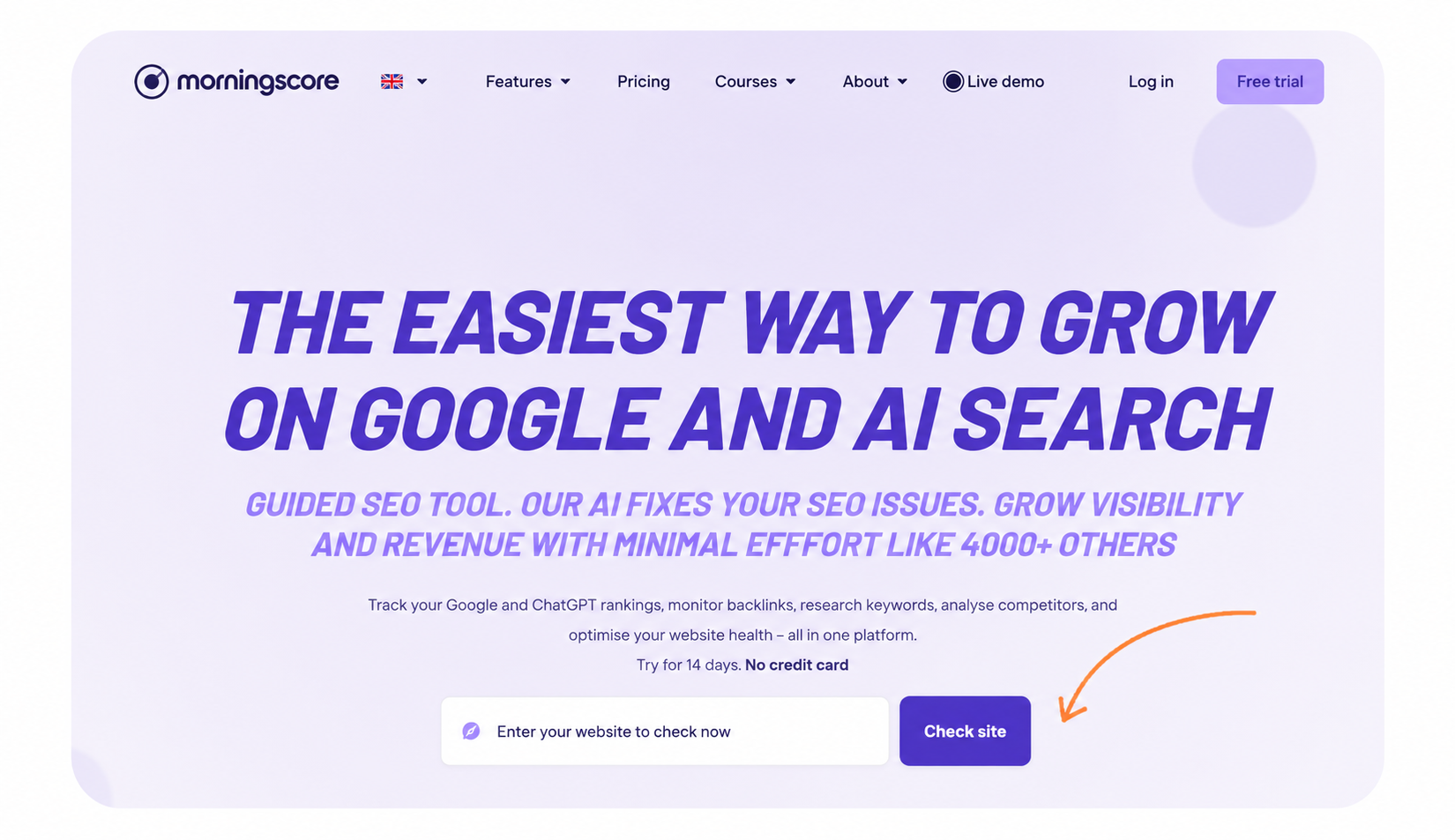
- Arrow icon pointing towards the button
- Hand-drawn arrow or circle around the CTA
- Micro-animation (pulsing button, hover effect)
- Icon that matches the action (calendar icon for “book meeting”, download icon for whitepaper)
- Portrait photo of the person you book the meeting with—makes the CTA personal
- Badge or label by the button (“Popular”, “Free”, “Takes 2 min”)
- Progress bar on multi-step forms, so it feels manageable
- Sticky CTA bar that follows as you scroll
- Exit-intent pop-up with a CTA when someone is about to leave
- Countdown timer for time-limited offers
A good exercise: close your eyes, open the page, and see where your gaze lands first. If it is not on your primary CTA, you have a design problem—not a copy problem.
Category 6. Copy to remove friction
B2B companies should take a page from ecommerce companies’ playbook when it comes to removing friction and driving people to take action. It is proven best practice that having a simple line of text right below or next to the button can make as much difference as the button itself.
It answers the objection the visitor is not saying out loud.
- “We have helped more than 2,000 Danish companies”
- “Takes only 2 minutes”
- “No obligation and free”
- “We respond within 24 hours”
- “No commitment” (mostly for SaaS companies)
- “100% free, no obligations”
Category 7. Social proof-driven CTAs
In B2B, you rarely buy alone—you often need to convince a manager or a purchasing committee. Social proof right by the CTA makes that job easier for them.
- A logo bar with well-known customers placed right above or below the CTA
- “See why 500+ companies chose us”
- “See what [well-known customer] says about us”
Category 9. Segmented CTAs
The more a CTA speaks directly to the visitor’s role or industry, the more relevant it feels. In my experience, a manufacturer in the pharma industry cannot relate to what the public sector is doing. So getting your visitors to look at relevant content can lead to more hard conversions.
- “See cases from your industry”
- “Are you a CFO? See how we save you time”
- “Solutions for [industry X]”
Category 10. Lead magnet CTAs with free value first
Some of the best CTAs provide something concrete and valuable before asking for anything in return.
“Book a free strategy meeting (value: DKK 2,000)”
“Get a free audit of your website”
“Get 3 concrete suggestions for [problem]—completely free”
How to choose the right one
With so many options, the easiest pitfall is trying to use them all at once. Do not. A good CTA strategy is about matching the CTA to where the visitor is in their journey:
- Cold traffic that has just found you: use categories 2 and 3—let them get to know you first.
- Warm traffic that is actively researching: use category 4—give them a tool that makes the decision tangible.
- Ready to act: use category 1—and let categories 5 and 6 ensure they actually click.
And remember: the best CTA is the one you actually test. This list is a starting point—not an answer key. Try a few suggestions, measure them, and keep the ones that genuinely move the needle for your business.
Enjoy picking and choosing.