
Content
18. november 2022
Examples of good typefaces
In this post, I will try to help you better understand typefaces by providing examples of good ones, along with advice on readability and what to pay particular attention to when choosing.
Some examples of good typefaces:
- Roboto
- Lato
- Ubuntu
- Playfair
- Open Sans
We focus on the web, as we are a digital agency, and therefore we relate to the area where we belong and where we are truly at home.
Frequently used typefaces
Out in the wider world, the most commonly used typefaces are:
- Helvetica
- Calibri
- Futura
- Garamond
- Times New Roman
However, we would not recommend the above for your website for many reasons, which I will go into more detail about later.
Instead, we most often use the following typefaces:
- Roboto
- Lato
- Ubuntu
- Playfair
- Open Sans
We most often use these because:
- They work well digitally, whereas other typefaces may be better suited for print.
- The shape of the letters makes them easy to read.
- They are fairly neutral typefaces, so they fit many different use cases across industries.
Test our 5 recommended font families
Which typeface is the most readable?
All of the above typefaces belong to the so-called “Sans Serif” family.
This group of typefaces has no “feet,” which makes it easier to read on the web, where the feet can quickly end up consisting of too few pixels and therefore become unclear to the reader.
On the other hand, typefaces from the “Serif” family are easier to read in print, as the feet are usually clearer than they are in pixels, and the eyes can therefore “follow” the feet as you read—guiding the reader’s gaze through the text.
Bonus info:
Open Sans is particularly good for improved web accessibility, including for people with low vision and dyslexia.
Readability does not depend only on the typeface
If you want to treat your readers (which should always be the goal) to great, easy-to-read text, you also need to be thorough when choosing how to format your type.
Because no matter which typeface you choose, the colour of the text must be selected based on the background it will be used on. For example, you cannot read pure white text on a black background, as the two are in such stark contrast. The same also applies to pure black text on a bright white background.
Instead, you should find some dark-grey shades that complement the white better, making it gentler on the eyes to read.
Pay attention when choosing a typeface
At Morningtrain, we primarily use Google Fonts because:
- They work on all web platforms (and across browsers).
- Other typefaces may require developers to make them work on the web (i.e., it can become expensive and cumbersome).
- Many typefaces cost money per load, or depending on what you want to use them for (print, web, brochures, TV commercials).
- And some typefaces may not be used commercially at all—so you risk not being able to use the same typeface(s) across media and campaigns.
Serif fonts have a more feminine expression, so be mindful of that when matching the font to the brand.
Check all formatting
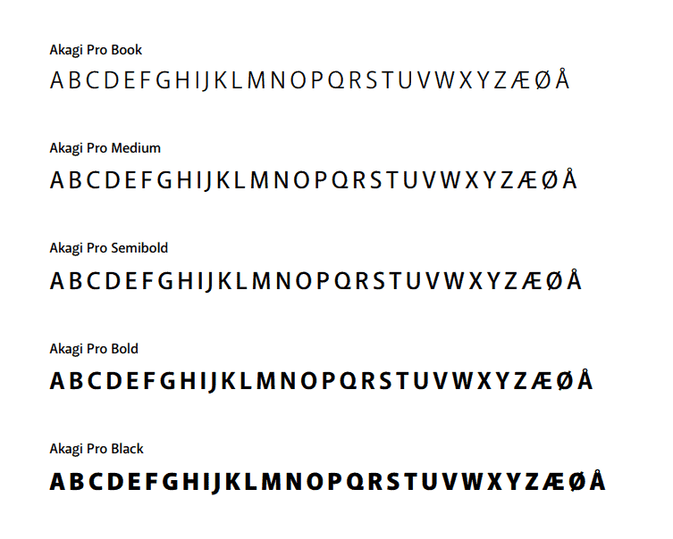
In addition to colours, you must ensure that all the letters in your typeface are easy to read and distinguish from one another—so review the entire alphabet in the typeface before you choose.
The most common pitfalls are:
- You cannot tell the difference between uppercase and lowercase “L” and “I”.
- You cannot distinguish between “b” and “p”.
- And “o” and “0” look too similar.
You should also remember to check whether the font supports the language you want to write in. Does your typeface include ÆØÅ, or umlauts (ö, ä, etc.), depending on the language you will be writing in?
Finally, remember to check all the typeface’s styles before selecting fonts:
- Bulleted list
- Italic
- Bold
- Underlined
- Uppercase and lowercase letters
The designer’s advice
Before you start exploring typefaces and choosing one, here is a piece of advice from a designer:
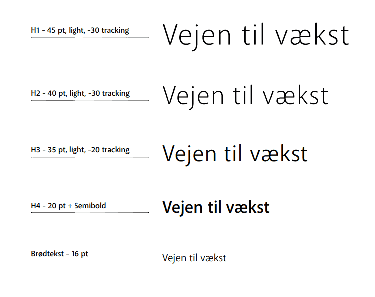
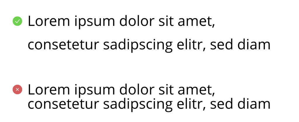
- Once you have chosen a typeface, you should choose a line height that gives the typeface its best appearance. Our recommended line height is 1.6.
Your line height determines how tightly your letters will sit in relation to one another. This can ruin even the best typeface.
- Do not use more than 2 typefaces on your website, as more than that creates clutter and makes it difficult to read.
This is because the brain constantly has to relate to different formatting, and ultimately you will experience it as disruptive to your reading. - Bonus: If you have two fonts, they should contrast with each other. For example, you can use a serif font for the heading and a sans serif font for the body text.
And a good little rule of thumb that you absolutely must take away from this: “Use common sense not comic sans” 😉
That is all—I hope you now feel equipped to dive into typefaces.