
Digitalization
22. December 2022
Mega menu | The domino effect of increased visibility
In this post, we take a closer look at the “megamenu” and menu dropdowns, and explore best practices as well as the pros and cons of this menu structure.

A bit of history about the origins of the megamenu
In the early days of the internet, site navigation often consisted of an increasingly large dropdown menu. You would typically land on the homepage, and most of the user journey was designed around finding your way through large and not always intuitive top menus.
For a long period afterwards, top menus were streamlined, and users were allowed to navigate partly on the site, but also by letting Google do the first part of the work so users could land directly where they had a need.
You can see this type of menu on most websites today.
But what happens if you have a very large website where the goal is to showcase many products or services?
You can get far with internal links, which will not only be part of your SEO, but will also naturally guide users through the buying journey. But what happens if an impatient visitor lands on your main page and struggles to find the specific product or service? They will most likely give up the search. The user will not be presented with your service/product page one you have undoubtedly spent a lot of time and energy creating.
If you search for menus based on design and UX, the recommendation will most likely be to keep it under 6 menu items. However, in recent years we have experienced a trend towards using large pop-up menus with many items, also known as megamenus.
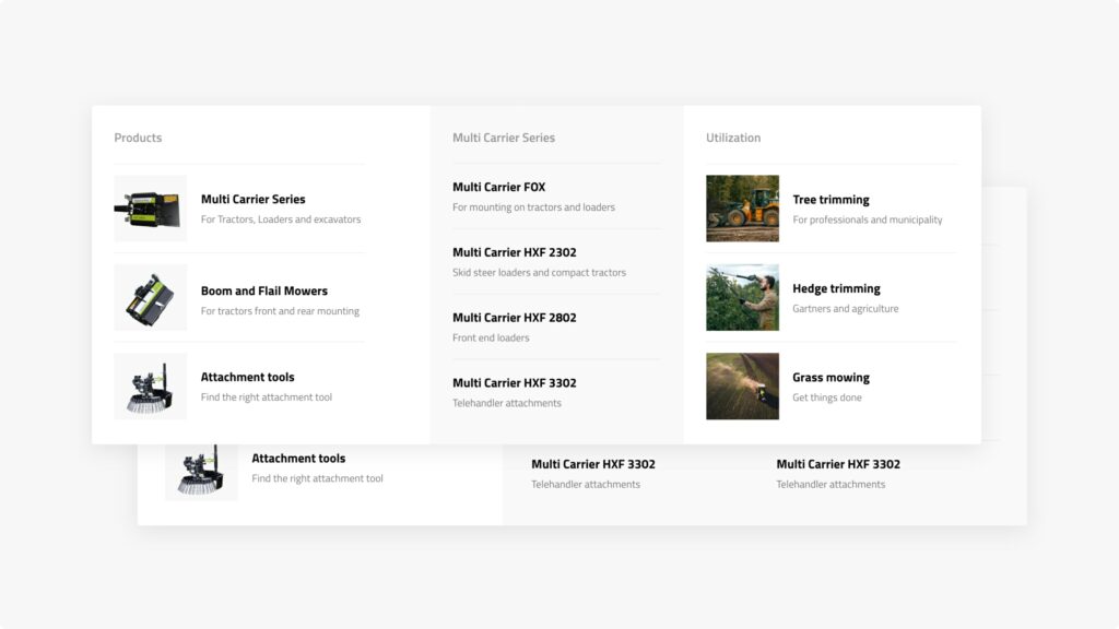
A megamenu is a large, complex menu most often used on e-commerce websites. It is a list of links displayed in multiple columns when you hover over a menu link.
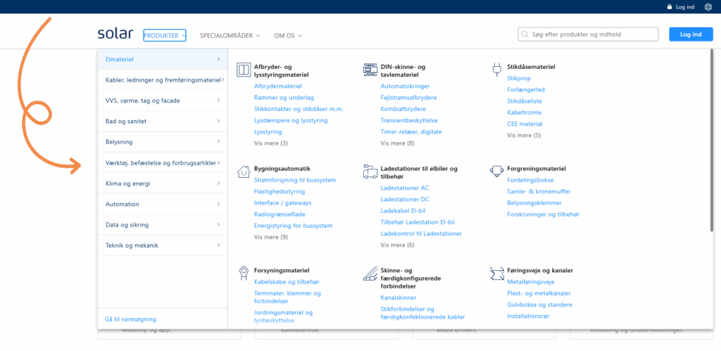
We are one of the companies that has moved away from a single-line horizontal menu in favour of a megamenu with nearly 50 items. It would not be like us to simply follow our intuition and ignore the data afterwards. So, in true Morningtrain spirit, we analysed the data four months after implementing the megamenu.
Our expectation which proved to be correct was that our page views would increase and that the pages would gain better visibility.
I know what you are thinking right now “No shit Sherlock, I could have told you that myself.” And yes, I partly agree, but guesswork and intuition will only get you so far. What I value most is data. After all, many agencies claim to have a data-driven approach, so why not show that it is not just sales talk.
The data that confirms the gut feeling
The data we collected painted a clearer picture of the impact of replacing a horizontal navigation bar with a megamenu.
The main benefit and the expected outcome of the above was higher visibility for the pages that are now shown in the menu.
To be more precise, we could see that the new pages now in the menu increased their visibility by an average of 135%.
For the pages that were visible in the old menu and in the new megamenu, visibility dropped by 38%, which is not unexpected. Visitors now have significantly more options and can go directly to the page they are interested in without having to go through the more general pages which are typically the ones shown in a single-line menu.
But the data showed more than just changes in visibility. The increased visibility of the many pages affected other important metrics on our website.
The first was the number of pages the user visited per session. Pages per visit increased by 13.5% across the entire website. The increase is entirely natural, as we now presented users with more options in the menu and therefore encouraged them to visit more pages during their visit.
In addition, the duration per visit increased by 37% across the entire website. An increase that may be due to several factors.
One reason may be that when we improve the user experience, we make it easier for users to find the page they are looking for. We therefore managed to reduce the number of frustrated users who would leave the site without finding the answer they were looking for. Another reason may be that users found a page that matched their search intent and therefore spent more time reading through the page content.
So what do you gain by using a megamenu?
Our data, combined with UX best practices, provides a better overview of the advantages and disadvantages.
Advantages of a megamenu:
- Increases the visibility of the pages included in the menu
- Extends the time users spend on the site and increases the number of pages they view
- Reduces the number of clicks required for users to reach the page
- Groups your pages into clusters and makes it very clear to both users and Google how they relate to each other.
- The megamenu gives the website a more modern look and feel
- Allows us to showcase our content in a more engaging way

Disadvantages of a megamenu:
- Reduces page views on the more general pages used in horizontal menus
- It is harder to maintain the same clean design and clear overview on mobile devices (creating issues for websites with predominantly mobile users)
- If it is not designed properly, it can make the website appear cluttered and overwhelming
Overall, the advantages outweigh the disadvantages of a megamenu. A megamenu is a useful addition to your website. It encourages users to explore more pages and therefore spend more time on your website.
Would your website also benefit from a megamenu? As always in the development world, the answer is “it depends”. It depends on the size of your website, the size of your user base, and the devices your users use. If you have a website with many pages that have the same or nearly the same value, and you want to make it easy for users to find those pages, then a megamenu could be a good idea.
Note
If your data shows that 4–5 of your pages generate the most value and account for the majority of your conversions, then by all means keep your horizontal menu bar.
Monitor your data and use your menu as a tool to direct traffic to the pages with the best conversion rate and a proven ability to create value for your business.