
Digitalization
5. June 2023
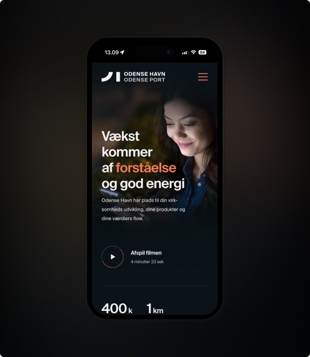
Create magical user experiences with responsive design
Responsive design is a method for creating websites and webshops that automatically adapt to the screen size they are displayed on.

What does “responsive design” mean?
It means that the page content scales and rearranges itself so it looks good and is easy to read and navigate, regardless of the screen size used. The goal is to give users a consistent, seamless experience across all devices.
“Responsive design” is on everyone’s lips, and of course that is because the majority of traffic comes from small devices (mobiles), and this trend is only continuing to grow.
In addition, Google only “crawls” your mobile site when assessing your relevance. In other words, Google evaluates your rankings based on the mobile experience—and that is regardless of how much mobile traffic you actually have.
Mobile-friendly design vs. responsive design
There are two primary methods for creating websites that work well on both large and small screens: mobile-friendly design and responsive design. But what is the difference between the two approaches, and how do you choose the right solution for your website or webshop?
Mobile-friendly design (also known as “mobile first”) means having a separate version of your website that is optimized for use on mobile devices.
This can be a good solution for businesses with very complex websites with lots of content and features that may not work well on a small screen and most importantly it is only a good idea if you have A LOT of traffic from mobile, not just in percentage terms but in absolute numbers.
The downside of this approach, however, is that you have to maintain two different versions of your website, which can be time-consuming and resource-intensive.
In addition, the costs of designing and developing this will mean your budget suddenly becomes x2, as in practice you have to develop 2 websites instead of 1.
Finally, it should be said that Google does not like it when you hide things. This means that if you want to give mobile users a completely different experience than desktop users, you must take great care to remove as little text as possible and instead “just” present it in a different way.
Responsive design is a more flexible and future-proof solution. Instead of having two separate versions of the website, you create a single version that automatically adapts to the screen size it is displayed on.
This means you only need to develop and maintain one website, and users get a consistent experience regardless of which device they visit the site from.
“Responsive design” is a broad concept, in the sense that you can optimize at different levels and degrees from simply stacking elements correctly, to elements looking different, having horizontal scroll, or something else entirely.
Responsive websites: What you need to consider
So what should you consider when creating a responsive website? There are some basic principles and techniques you need to have under control before, in my book, you can call your website responsive.
First and foremost, it is important to think in “screen-size groups” rather than specific screen sizes. There are countless different screen sizes and resolutions out there, and it would be impossible to design a website that fits each one perfectly.
Instead, you should think in groups of screen sizes, such as small, medium, and large screens, and ensure the site works well on all screens within these groups.
Another important part of responsive design is using “media queries”. This is a technique that makes it possible to apply different CSS styles depending on the screen size. That way, for example, you can change the font size when the site is displayed on a small screen, making the text easier to read.
My little checklist:
- How you want the elements to stack
- Elements that contain multiple examples should have horizontal scroll, so you reduce vertical scrolling.
- What the font should look like (size, colours, etc.)
- Are there visual elements that should be removed on small devices?
- How do you create the best navigation?
- What do CTA buttons and links look like on mobile?
What about a responsive webshop?
When it comes to creating a responsive webshop, there are some specific challenges and features you need to be aware of. Here are some key features to consider when designing a responsive webshop (in addition to the suggestions we made for websites):
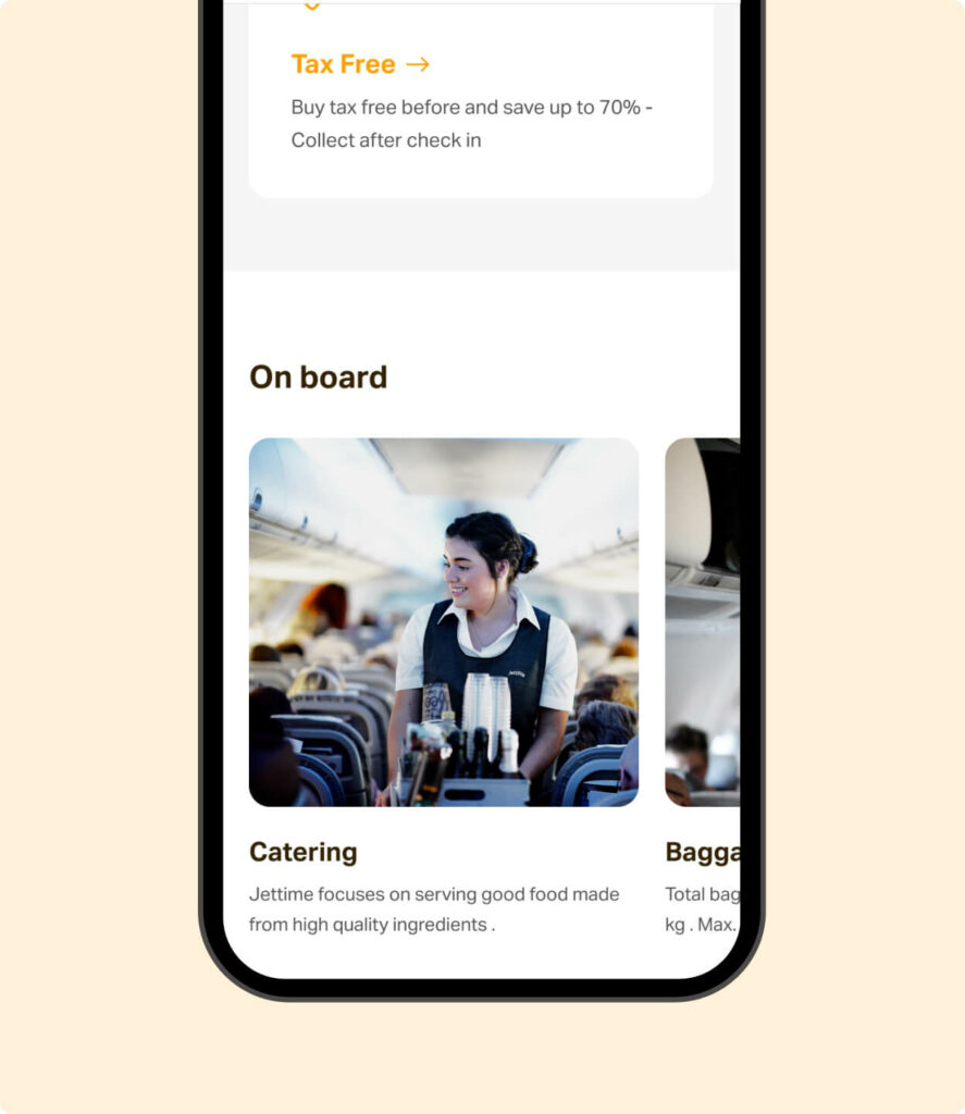
Product galleries and images:
High-resolution images are crucial to giving customers a good experience when shopping online. But large images can also make the page slow to load, especially on mobile devices.
It is therefore important to find a balance between image quality and page speed when creating a responsive webshop.
Navigation and menus:
When creating a responsive webshop, you need to consider how navigation and menus work across different screen sizes.
It may be necessary to hide some menus or change their placement on the page when the shop is displayed on a small screen. A popular solution is to use a “hamburger menu” that can be opened and closed as needed.
Cart and checkout:
One of the biggest challenges in creating a responsive webshop is making the cart and checkout process easy and seamless on all devices.
It may be necessary to simplify the checkout process and make it easy for customers to enter their details, even on a small screen.
Even though this is not about responsiveness, consider whether the payment solution you offer your customers works well on mobile (does it support MobilePay, does the window display well on mobile, etc.).
The product page experience:
Make sure the product “single page”, as it is called, provides a good experience. This is presumably where most people will spend the majority of their time on your webshop.

Challenges in responsive design
Mastering responsive design is not always a walk in the park. There are plenty of challenges you may run into when trying to create the perfect responsive website or webshop. Here are some of the fun and frustrating situations you might end up in:
The never-ending battle between design and functionality
When creating a responsive website, you need to find a balance between an attractive design and user-friendly functionality.
It can be tempting to go all in on visual effects and animations, but it is important to remember that the site must be easy to use and navigate, even on a small screen.
Text that almost disappears
When working with responsive design, you may encounter situations where the text becomes so small on a mobile screen that it is almost impossible to read. It is important to test your website on different screen sizes and ensure the text is always readable and easy to understand.
Images that go wild
Another classic challenge in responsive design is getting images to scale and behave correctly across different screen sizes.
It can be complicated to make an image fill the entire screen on a large display while also scaling down to a small screen without looking odd or compromising quality.

The desire for the best user experience vs. your budget
The biggest obstacle to fully focusing on the customer experience and thus responsive design is your wallet.
There is no limit to how many parameters you can adjust when it comes to responsive design. On top of that, “what a good user experience is” is also subjective, so you need to appeal to many different user patterns.
That is why I say responsive design is a broad concept. A site is technically responsive if you can access and read the content on all devices. But there is a long way from that to delivering the best user experience on all devices.
Therefore, you often have to make choices about what you WANT to optimise and more importantly which screen sizes you choose to prioritise. And then you have to turn a blind eye to the rest, as the budget can easily be drained into the black hole that is mobile optimisation.
Tools to test and improve responsive design
There are several tools and resources that can help you test and improve your responsive design:
- Google Chrome’s Developer Tools contain a range of tools and features that make it easy to test and debug responsive design. You can, among other things, simulate different screen sizes, test page speed, and find CSS errors.
- Responsinator is an online tool that makes it easy to test your website on different screen sizes and devices. You simply enter your website’s URL, and the tool will show how the site looks on different screens.
- BrowserStack is a paid service that gives you access to a wide range of devices and browsers, so you can test your website under realistic conditions. It is a useful resource for web designers who want to ensure their website works well across different platforms and devices.
Conclusion: Embrace responsive design, but set limits
In today’s mobile-driven world, it is more important than ever to master responsive design and create websites and webshops that work well on both large and small screens.
By adopting a mobile-first approach and using the right tools and techniques, you can create an attractive, functional, and user-friendly website that appeals to users and ensures online success.
BUT!
The possibilities are endless, and the budget is not. So make some choices based on what gives you the most with the least effort, and then implement those. You should overlook the final fine-tuning, as you can never fully clear the “optimisation list”.