Content
20. August 2024
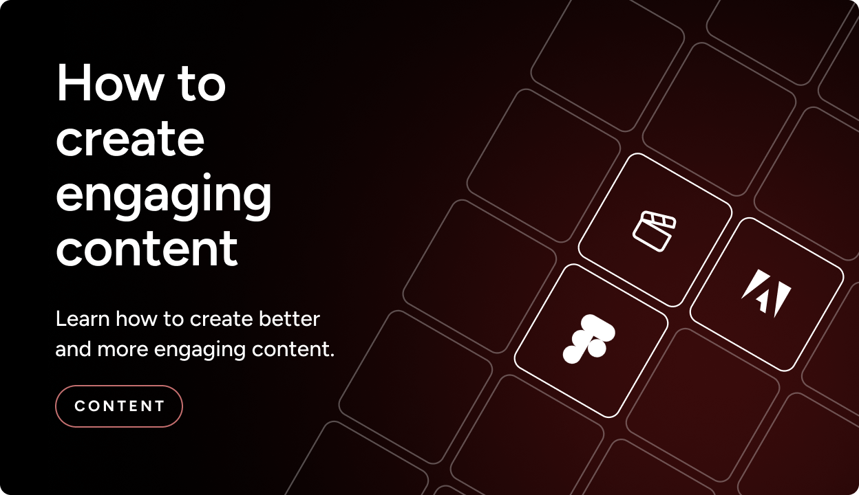
How to create compelling content
In this article, we will thoroughly review how you can develop and produce better content that retains, engages, and converts your target audience.
You create compelling content by doing the following:
- Know your target audience what do they want to be met with
- Improving the user experience
- Use images, video, and illustrations to increase patience
- Ensure that your content provides real value for the reader
- Be authentic in your content
Do you also find that your patience on websites is getting shorter and shorter?
You are not alone. These years, all companies are fighting a tough battle for their web visitors’ attention.
In fact, studies show that only half of digital visitors stay on a page after reading a little of an article if they have not already bounced just seconds after landing on the page.
Similarly, studies from the digital article magazine Slate.co show that a large share do not even scroll on the website, and only 60% read a web article to the end.
(See the chart below)
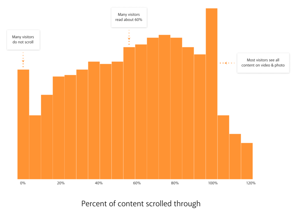
Source: Slate.com
Think about it: How many of the articles you check out every day do you read in full? Not many, right?
This trend creates sales challenges on your website. Customers only buy once they know you and trust you. But if they do not take the time to get to know you, then we have a challenge.
With this guide, I will help you solve that challenge by providing input on how intelligent design and strong content can help you win the battle for attention.
Disclaimer: The target audience for this article is you, who in the coming period will actively work with your company’s website and are looking for concrete inspiration. If, on the other hand, you are looking for a quick fix and a fast overview, then this is not the right article for you)
Improve the user experience – know your target audience
It can be difficult to attract the desired visitors to your website if you do not communicate directly to them.
Therefore, first and foremost, it is important that you know your target audience. Who are you speaking to through the website? Are you speaking to private consumers without extensive knowledge of your product, or are you speaking to B2B specialists?
It is not only important to be able to “tick off” these factors on the list in relation to your choice of language on the page; it is also highly important in relation to the visual layout.
Your choice of design is closely linked to the amount of written content and the level of technical language you use on the website.
On a B2B website, it is a good idea to use “heavier” professional language that is to the point. Your B2B visitors are often clearer about what they are looking for- especially if they are specialists.
Conversely, on B2C websites it is a good idea to guide your visitors and present keywords, key points, or products clearly and prominently to inspire them.
Images and videos increase patience
Another key point is that we, as online consumers, have become more “spoiled” and impatient.
In our experience, this means that private consumers respond best to easily accessible information. And if they do not find it quickly, they simply look for it elsewhere.
An effective website design should therefore be easy to take in at a glance, and the design should communicate selling points faster and include visible calls to action.
If we connect this to Slate’s article, they also state that websites with images and videos engage website visitors significantly better and that web articles with images and videos are most often read through!
Over the past few years, there has also been increased focus on visual content.
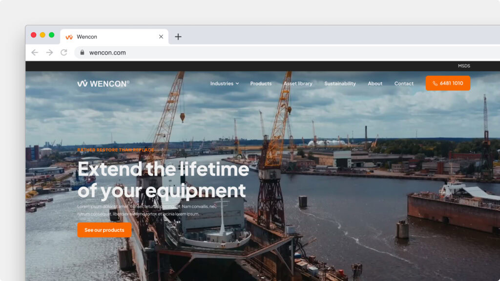
Design is built with plenty of whitespace and minimalist traits, which first and foremost makes it pleasing to the eye. In addition, there is more focus on video & image content and the often more limited text on the website – see, for example, how Apple does it.
The goal of websites (and web design) is largely about building trust with users through a personal design. Make sure to create a great experience on the website that lets visitors fall a little in love with it.
Create a strong value proposition with compelling content
Content can be many things. In this context, we mean content that reflects you as the sender and that appeals to your target audience.
Show your references, your cases, and your employees. Present them with reviews, testimonials, and images and with well-written, compelling copy.
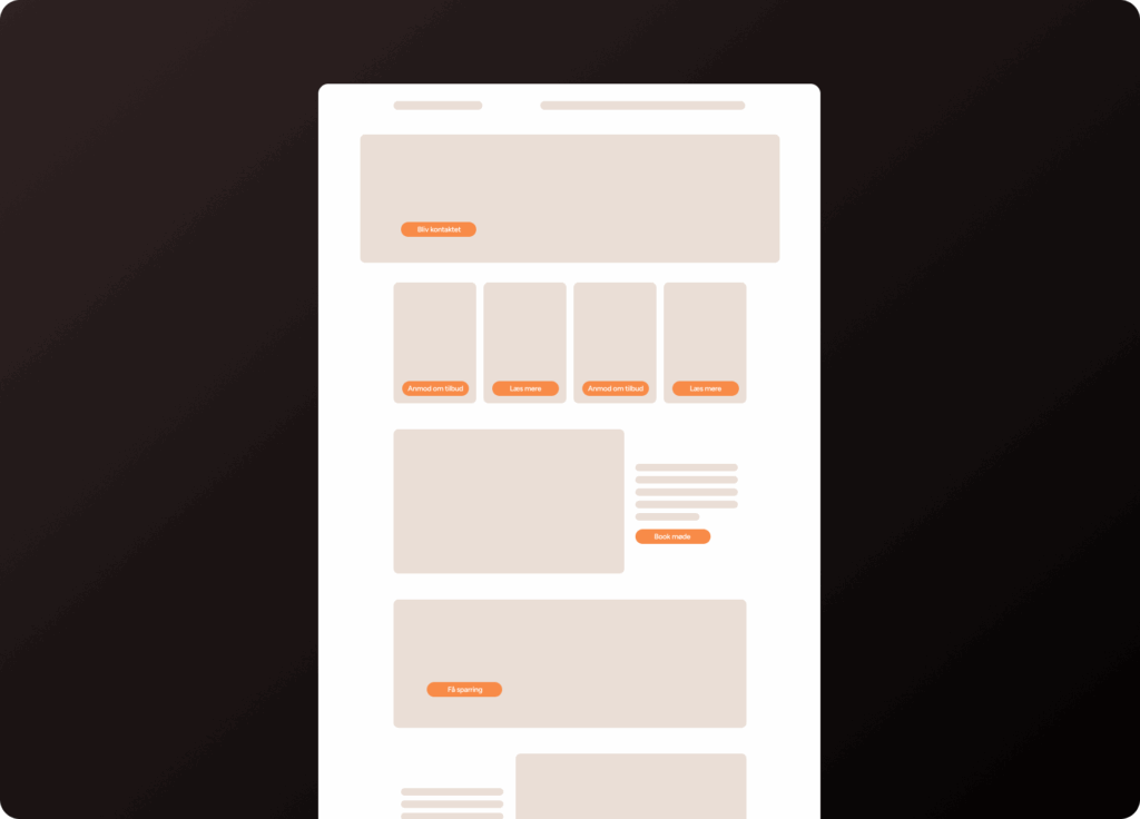
Create a strong value proposition and avoid the pitfalls: All high-converting websites have (at least) one thing in common: Visitors feel they are getting value.
Crazy Egg has conducted a study on good website conversion. It showed that the clearer the offer you present to your visitors on your website, the better your website converts.
And remember that an offer can be many things it does not necessarily have to be a price saving; it can also be an offer of sparring or advice, if that is what you excel at.
In other words, it is about a strong value proposition, and that is what we will take a closer look at.
Lav din value proposition
Udfyld felterne nedenfor, og få et godt udgangspunkt at arbejde videre ud fra. Sætningen et ca. 70-80% i mål, så du kan selv berrige den bagefter, så den bliver helt perfekt.
Denne model gør det nemt at konkretisere, hvem du taler til – og hvorfor de skal lytte.
Bemærk: Den endegyldige formel kan godt kortes lidt ned, og nogle stopord skal måske skiftes ud, men man får 75-85% af essen frem med denne formel.
Value proposition, relevance, clarity, urgency, disbtribution, anxiety.
And as stated, the value proposition is the most important element—that there is value for your visitors. Next come relevance and clarity, which are clearly tied to value creation.
The urgency element determines the speed of your conversions. Then there are distraction and anxiety, which are elements that can especially be counteracted with good design and strong content.
It may go without saying, but the more “obstacles” your visitors encounter on your page, the greater the likelihood that they will leave again.
When it comes to web design, it is therefore particularly important to focus on three of the factors: clarity, anxiety, and distraction.
Urgency can be driven by the design, but above all it is driven by your offers and the written content on the website.
Crazy Egg points out that a good, high-converting website guides its visitors from the most important element to the second most important, the third most important, and so on. In contrast, a poorly converting website more or less leaves visitors to themselves.
“More distractions = less clarity”
(Source: Crazy Egg)
Clarity and distractions often go hand in hand: If there are too many distracting elements on the website, it affects clarity.
That is why there is a very good reason the minimalist “semi-flat” design style is paving the way forward: Because it sharpens clarity and works better with value-creating factors, without confusing your visitors.
At the same time, this design style allows you to personalise the design with, among other things, shadows and gradients, which also add edge. For example, this is not “allowed” in other design styles.
I have previously mentioned Apple as a good example. But sites like Pinterest and MailChimp are also good at exactly this.
Summary
Of course, no one can predict the future. But you can always take a look at the trends—and that is what we will do here at the end.
- Simple, minimalist design with plenty of space and whitespace
Clear “paths” in the form of CTAs are definitely one of the things that is trending right now, and will most likely continue for quite some time. - More personality and clarity
We expect the use of personal photos and videos of the people in the company to play a bigger and bigger role on company websites. However, it is still about staying true to the minimalist style and ensuring that the number of visual expressions is kept thoughtful and restrained. - Urgency will become a bigger X-factor
We expect urgency to be leveraged more and more precisely because people are becoming increasingly impatient. This could be through smarter FAQs (perhaps even on video) or chatbots, where your visitors can get answers to questions in no time. This creates the necessary added value on the website, which can be the decisive difference in your customers’ purchasing decision. - Be authentic
We expect to meet the company as it truly is. We do not want clichés, glossy images, and generic impressions. We want to feel who we are doing business with, and therefore being authentic in your content is a winning trend. It should shine through who you are. - Increased use of images and videos
We are visual beings, so we enjoy visiting a website that makes use of visual expressions to a much greater extent. And it is probably especially the video part that we expect will be the biggest theme in the years to come.
Do you have any questions or comments?
Thank you for reading!
You are always welcome to ask us for advice, so please feel free to contact us if you have comments on the blog post or are left with questions.
If you would like to know more about how to improve your site’s design, you can check out the two blog posts on visual hierarchy and white space.