
Digitalization
19. October 2022
Website optimisation checklist
This post is packed with concrete initiatives, changes and optimisations you can implement on your website to increase your conversion rate and convert more visitors into leads.
Content
Why even bother? The checklist Keywords and words Clear USPs Information structure Social proof Price point Call to actions Page speed Internal navigation Visuel aidsYou can optimise your website effectively by doing the following 9 things:
- Use clear USPs on the website
- Use clear and distinct ‘Call to actions’
- Optimise your website speed
- Incorporate the keywords you primarily focus on into the relevant landing pages
- Show ‘social proof’ by including customer reviews or logos
- Optimise internal navigation
- Use a clear information structure that answers the user’s questions
- Use visual aids such as images, video, infographics and icons
- Consider showing a price point if possible (price examples, package prices or starting-from prices)
Of course, you do not need to do everything on the list, but the more you cover, the better optimised the site will be.
Why should I spend time on this?
Before you rush out and run a lot of marketing campaigns, you should pause and make sure your website is optimised so it gives your visitors the best possible experience.
Far too many marketing professionals do not consider their website to be part of their marketing effort.
The website is where you will send all the traffic. So before you invest huge sums to drive a lot of traffic into the “shop”, make sure the shop (figuratively speaking) looks good. It should be intuitive, communicate clearly and understandably, and have the right products on the shelves.
The marketing effort you can get the most out of is optimising your website, because it increases the return on all your other efforts.
- You can make your SEO efforts work with the wind at your back.
- You can increase conversion rates from the traffic generated by your campaigns.
- You can reduce the bounce rate of all the traffic you have acquired.
- You can increase your website speed, which leads to both higher rankings and higher conversion rates.
- You can reduce your cost per click from your ads due to increased relevance.
In other words, website optimisation delivers returns across so many verticals that it seems foolish not to start here before increasing your ad budget.
If you do not do this, you will miss most of your marketing potential.
So do not be one of those who make this mistake.
Design your website the way you would design your shop
Just think of the shops on the high street: they are all designed with the customer in mind.
The storefront is neat and inviting. In a split second, you can tell what products the shop sells. There is no doubt where the entrance is. Inside, all products are carefully organised. Clear signs point customers to the fitting rooms. And at the checkout, it is clearly marked which cards you can pay with.
Your website should be just as customer-centric. The user experience should make it easy for users to understand who you are and what you do, as well as what you can offer. But it should also be clear what you cannot do. Whether they choose your product or not is secondary so long as they can make an informed decision and move on with their lives.
Conversion optimisation checklist
Yes, that was a long word (conversion-optimisation-checklist).
What needs to be optimised on your website varies from case to case, as it naturally depends on your starting point. So instead of creating a “one size fits all” playbook, we have put together what we believe should be your checklist to review when optimising your website:
- Incorporate the keywords you have selected into their respective landing pages
- Clear USPs
- Use a clear information structure where you answer the following in this order
- What is it?
- Who uses it?
- What do you get out of buying the product/service? (Translated into the customer’s reality)
- Who is the product aimed at? (Industries, niches, countries, etc.)
- How do I learn more?
- Social proof in the form of reviews, customer or partner logos
- A price point if possible. Price examples, package prices, starting-from prices, or similar.
- Clear and distinct CTAs
- Is your site fast enough?
- Internal navigation – a page must never be a dead end. Users should always be able to move on from a page.
- Visual aids such as images, video, infographics and icons.
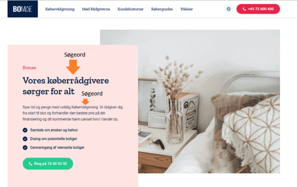
Incorporating keywords or wording from marketing initiatives
It is very important that visitors who choose to click your ads land on a website that resembles what they clicked on.
By that we mean that the visual expression of the ad (on social media) and the wording provide a consistent experience.
If you work with search engines, it is an absolute necessity that you have incorporated your keywords on the landing page you want to rank for. In addition, incorporating them also serves to reassure the visitor, as the website speaks the same language as the ad.
Clear USPs for the customer
Make it easy for your visitors to quickly understand the benefits of doing business with you specifically.
At the end of the day, what your customers buy from you is really the value you attribute to them whether it is the status they feel they gain from buying a consumer product, process optimisation or increased revenue. It all comes down to “what’s in it for me?”.
So when you have visitors on your website, users put themselves first (just as you do when you are a customer), and they try to determine whether you can provide the value they are looking for.
This is where USPs come into play…
With the right USPs, you can quickly and precisely explain to your target audience the value they get from you, instead of them having to figure it out from all your content.
Just consider the following:
- When you need to buy something, would you rather read 2,500 words on a website to understand whether it is the right product and supplier for you?
- Or would you rather read 3–5 bullet points that quickly clarify the very same thing for you?
Define different USPs
Your customers will have different focus areas in terms of the value they want to receive. Therefore, I recommend having 3–4 USPs that cover different parts of the value you/we offer.
Consider the following:
- Are there financial savings?
- Are there time savings?
- Do you provide peace of mind? For example, legal certainty or GDPR compliance?
- Do your customers rate you highly?
Examples of USPs
- “For scanning food products”
- “Effective on rough surfaces”
- “Support in 17 languages”
- “Up to 24% less waste in production”
- “Next-day delivery”
- “50 years of experience”
- “4.8 TrustScore on Trustpilot”
- 30% shorter implementation time
Use a clear information structure
You need to guide your visitors to understand your company, service or product. Therefore, you should present your content in a specific order, so you take your visitors by the hand.
In other words, each section on your website should serve a purpose, so it is not just text for the sake of text.
We recommend the following structure:
- What is it? The first element should set the scene and explain who you are, or what your product is.
- Who uses it? Include some social proof early on the page to “buy” the reader’s interest. You can show cases, logos, reviews or similar. In other words, you need to show who the content is relevant for. You can read more about social proof in section 4.2.4.
- What does it do? Now you have people’s attention, so you need to tell them what they gain from using you or your product.
- How do you work? Especially in B2B, it is a good idea to outline your process whether for onboarding, project execution or similar.
- What does it cost? If we had to choose, include a price example, a package example or a starting-from price anything that gives an indication of the financial scope of the purchase.
- How do you get started? Describe what an onboarding would look like and what you would need from the customer to get the project started.
- From here, you have free rein on the page.
Social proof/trust
We need to trust the people we do business with. I probably do not need to elaborate. And what is most credible:
- That I write that we are simply exceptionally good and always listen to our customers?
- Or that customers say we are exceptionally good?
So the easiest way to build trust with the visitor and thereby “buy” their patience is to show them who your customers are, or what they say about you.
This can be done in several ways, but the three classic and most effective solutions are:
- Your Trustpilot score embedded on the website
- A logo row with some of your customers’ logos
- An excerpt of testimonials you have received from customers.
NOTE: Please place your social proof in multiple places on the pages and preferably above the fold, i.e. before people scroll.
Setting up a price point
This point is highly debated, especially in B2B companies, as you generally prefer not to show your prices. Here are some of the most common reasons:
- We do not have a list price, as the price depends on the customer’s solution
- We are not a packaged solution
- We prefer not to show prices until someone has spoken to sales
- We do not want competitors to see our price point
- We do not compete on price
But hear me out…
By price point, I am not trying to sell anything based on price. Instead, I want to:
- Create context for the visitor.
- Remove a barrier the visitor may have, because we tend to assume something is more expensive than it is when no price is shown.
- Tell my customers what is included in my pricing, so they do not compare me with the discount competitor.
- Further qualify enquiries. If you think my product costs 1/10 of what it actually does, it is better that you know before you call because we are so far apart that we will end up wasting each other’s time.
Price points can be presented in many elegant ways, but my two favourites are price examples and starting-from prices.
The price example
With price examples, I get the opportunity to show my visitor what I have built into my product, which may not always be obvious.
For example, if you are a leasing provider and you factor in that you are liable for the residual value and the agreement includes insurance, it is important that you are not compared with a competitor who has removed all of this from the product to appear cheaper.
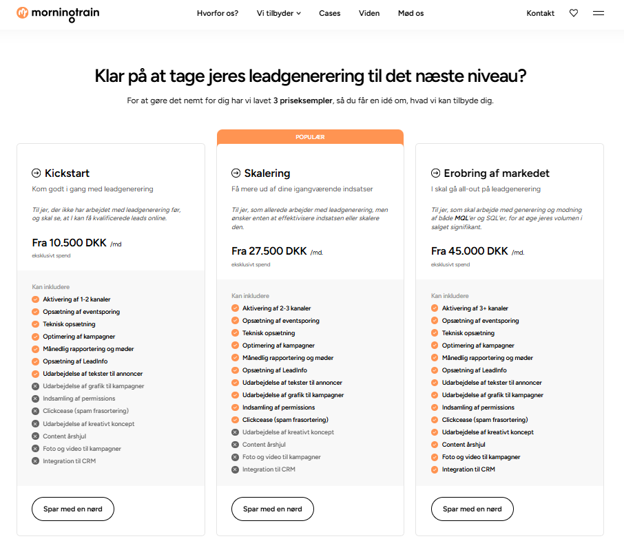
It is important to understand that you can absolutely sell a custom product and still have price examples. The example below is from Morningtrain.dk, and if you want something that is not mentioned, the price is tailored uniquely to each customer.
So the price example primarily serves to provide a “rough idea” of price (price point) and to educate the visitor on what should be included in the product.
Starting-from price
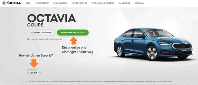
This is the easy one. What does your solution start from? My best example is the purchases that are often the biggest private purchases people make: cars.
When you say the new Skoda Octavia starts at DKK 249,995, we all accept the premise that YOUR version will not end up costing that, because you will want extra equipment, a cup holder and the whole lot but you have a rough idea of what the car costs.
After Morningtrain introduced starting-from prices and price examples, we found that we got:
- More enquiries, as people now had confirmation that they could afford us
- More qualified enquiries, because those who could not meet us budget-wise did not contact us at all.
My message is that you should test it.
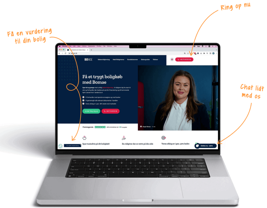
Clear and distinct CTAs
No matter which conversion optimisation book you open, page 1 says: “Have clear call to actions” (CTAs).
I would like to spice it up a bit: Offer your visitors clear and distinct CTAs, so there are more opportunities for interaction.
So the task is not only to ensure there is always a phone number to call, but also to introduce several different CTAs, because your visitors are at different stages in their decision-making process, and therefore what they are “ready to do” varies.
Our recommendation is to create a list of both hard and soft CTAs, and then ensure each page uses 2–4 of each.
Examples of hard CTAs:
- Call us
- Contact us
- Book a demo
- Get in touch
- Chat with us
Examples of soft CTAs
- Read more
- Get inspiration
- Sign up for the newsletter
- Receive our brochure
- See which trade fairs we are attending this year
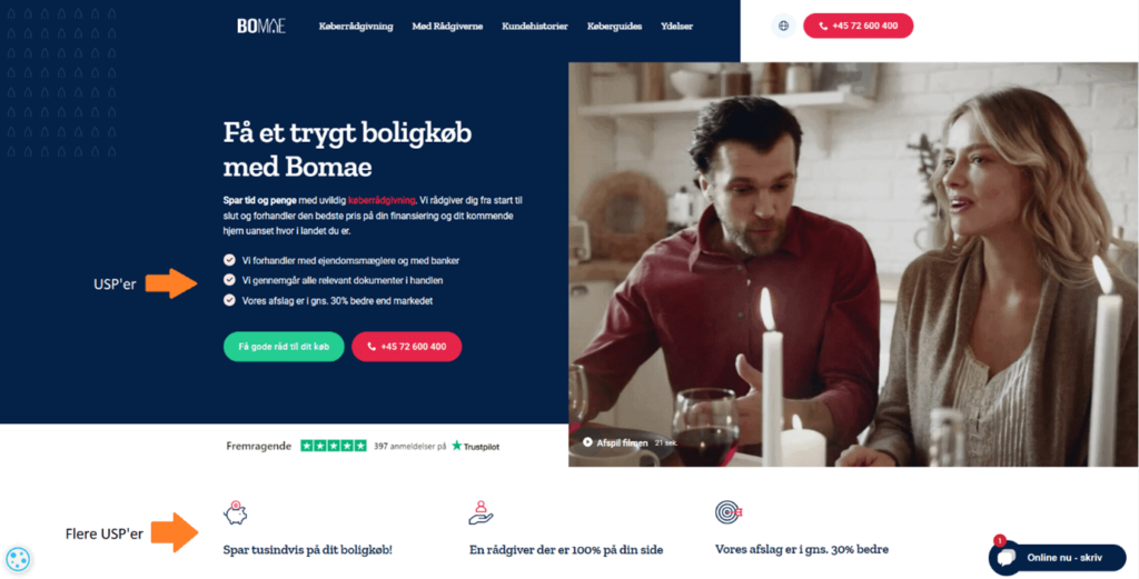
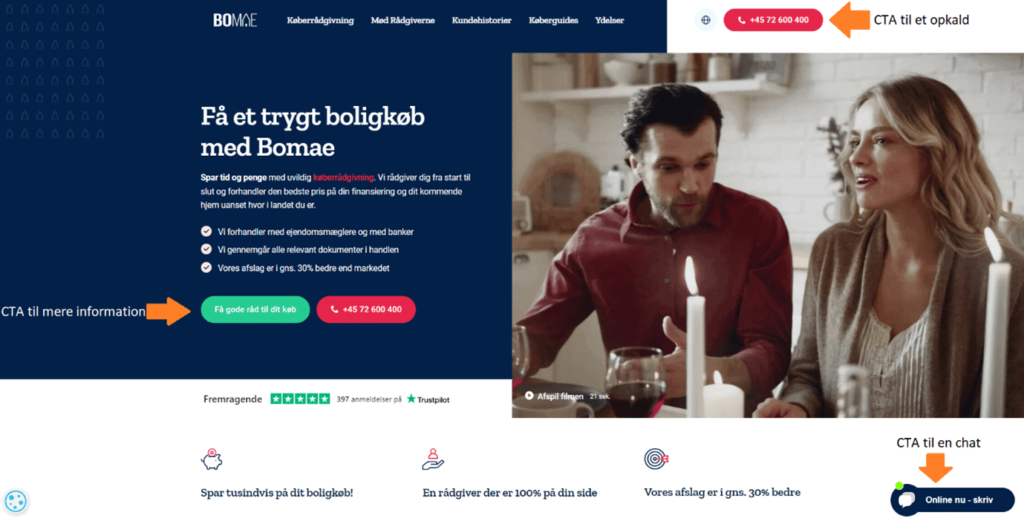
The point of CTAs is to present the visitor with what the next action can and should be—for example, chatting briefly with a consultant before being ready to call, or perhaps going in to get some inspiration, as in the example from Bomae below.
It is a good user experience to be presented with the options available, especially if the CTAs are based on the user’s buying journey.
Speed optimisation
Having a fast website is the closest you will get to a real ‘life hack’ in online marketing.
There are so many positive knock-on effects that this optimisation MUST be on your checklist before you start your lead generation.
- Users love it!
Have you ever been sitting on a train with barely any internet connection and tried to load a random website? You certainly know it yourself from browsing the internet and landing on a website that takes 5, 10 or 15 seconds to load: you are already on to something else—because the site probably does not work (you think). By having a fast website, you create an experience for the user that is far more pleasant, and therefore a site they do not click away from immediately. - Search engines love fast sites
In each of Google’s major iterations of its algorithm in recent years, they have incorporated a greater weighting of speed metrics. And the other search engines… well, they copy Google. The reason it is so important to search engines that your website is fast is that it gives users the best experience. A slow site will cause more users to leave before the site has even fully loaded. This means your bounce rate (bounce rate) skyrockets. A high bounce rate will be penalised in your organic search rankings, as it strongly indicates that people are leaving your site; ergo, you must be irrelevant, and the search engines will give the rankings to someone else.
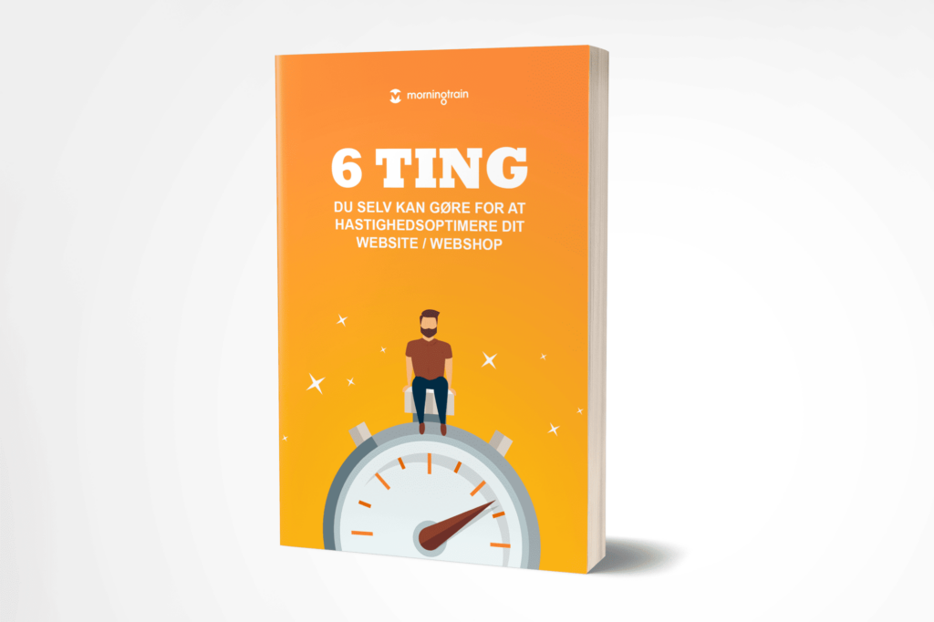
I have previously written an e-book with 6 practical tips on what you can do to increase your website speed. You can find it via the link here.
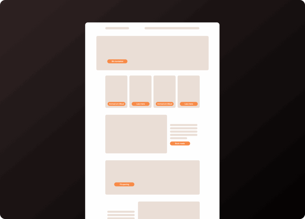
Internal navigation
Make sure you help your visitors navigate around your website. You should do this both via your menu and down your landing pages.
None of your landing pages should be a dead end. In addition, you make it easy for your visitors to find relevant or related content on your site.
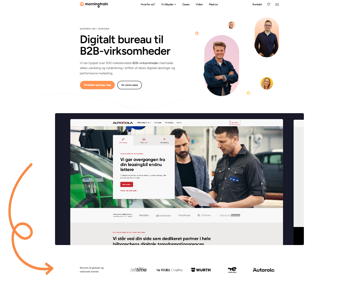
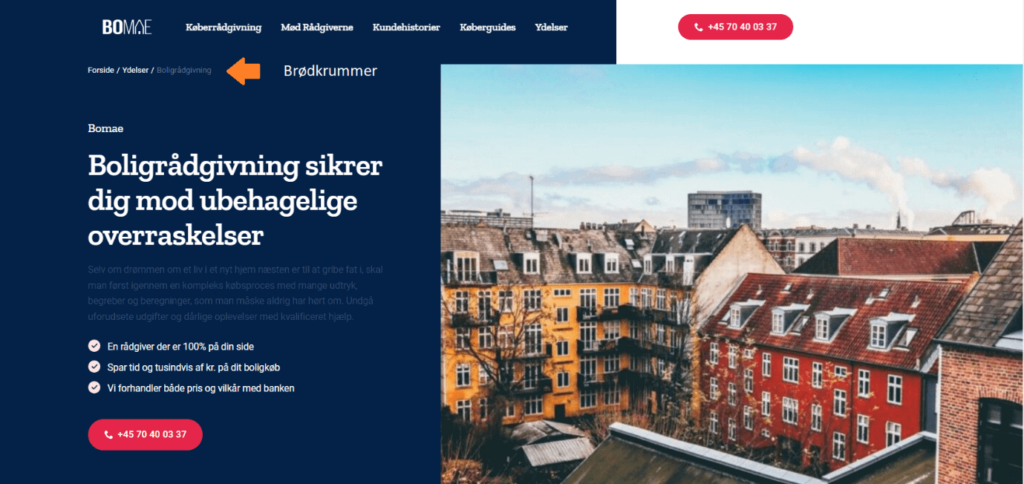
Internal navigation also enables your visitors to dive deeper into different parts of your content (as the example below shows).
Another important thing to remember is that your menu should be intuitive and help the user find their way around. So consider what you name your menu items, so it makes sense and provides value for the visitor instead of being internal lingo.
You can also implement “breadcrumbs” on the website to help the visitor understand where they are on the site and how to easily find their way back:
Bonus note:
Internal navigation also helps search engines find their way around the site, and it reduces your bounce rate because people move on from the homepage. This means it is also beneficial for your SEO.
Visual aids
No one wants to look at a “wall of text”. As a rule, your visitors read in the following order:
- The headings
- The images and videos
- And then, if it catches their interest, they may skim a block of text
So instead of trying to write and explain everything to the visitor, capture their attention by illustrating it instead.
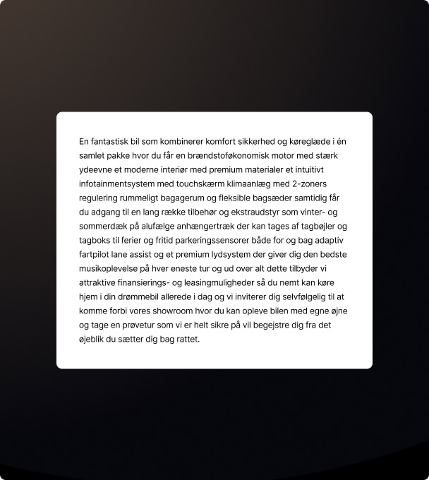
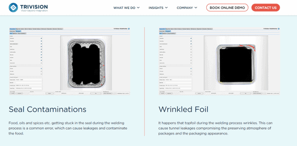
The examples below are from a B2B company that works with machine monitoring in the food industry.
Example:
Avoid these pitfalls in website optimisation
- Do not limit your efforts on the website because you “cannot quite figure it out”. All your efforts from here on will be about attracting traffic to your website. So if your website does not have a reasonably solid starting point, you will get less out of your marketing activities. Conversely, a good site can give your marketing efforts a real tailwind.
- Do not limit yourself to optimising text only. Your visitors will skim your website by reading headings, looking at images/videos and reading CTAs, so make sure these make sense.
- Do not optimise the site so it makes sense internally to you. Think about the visitors instead. You can get very useful feedback from your sales leads, as they know what customers ask about and look for, and what usually “works” when they are in a sales meeting with customers.
- Be careful not to have too few conversion options. Many websites only use CTAs such as “Contact us” or a phone number.
Introduce some conversion options that appeal to a different type of visitor those who may not feel like picking up the phone. A contact form, a chat or the option to simply download a brochure speaks to a completely different type of person.