
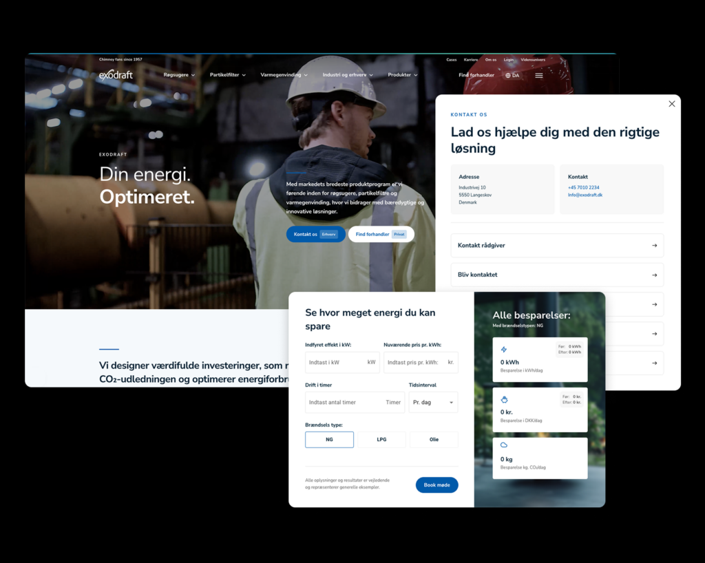
Digitalization
9. June 2021
Have you misunderstood UX?
UX is all about graphics, aesthetics and illustrations, right? We understand if that is what you are thinking.

Content
What is UX Should it look nice UX or UI Example of bad UX What is good UX Example of good UXFirst and foremost – what is UX?
UX is an abbreviation of the English term “User Experience”, which translated into Danish is: “user experience“.
The term UX refers to the overall experience a person has when interacting with a product, service, or digital platform.
However, there is a misconception that for many years has spread like wildfire and has never really been properly put out. It is the idea that UX equals a sleek, modern, innovative design. That is simply not correct.
UX is about putting users at the centre of the design process and creating solutions that are intuitive, efficient, and satisfying to use.
By focusing on the user’s needs and wishes, you can create experiences that make a positive difference in people’s lives and/or business.
UX design is an ongoing process that requires constant evaluation and improvement to ensure that users’ expectations are met in an ever-changing technological world.
But UX has to look great… right?
No, not necessarily.
Just because something is new and looks great from a design perspective does not automatically mean it provides a good user experience.
When people navigate websites, they use the part of the brain that contains experience, memories, rules of thumb, etc.—in other words, things that help them make quick decisions. After all, everyone has used a website/webshop before, right?
That is why good UX is not about innovating things that already work. Instead, it is about using the elements and layout the user EXPECTS.
Imagine an office where all door handles were placed on the left side of the door… that is innovative! But it is not a good user experience. Or a car where we swapped the accelerator and the brake – really not smart, right?
Here is a closer look at the best practices for a great user experience:
- Flow
There needs to be a natural flow on your site. It should feel natural and straightforward, so your visitors are not bouncing around trying to find what they are looking for. To create a great flow, you can, among other things, use CTA buttons that guide visitors to what matters most, or colours and contrasts that catch the eye at the right time. - Contrast and colours
With contrasts and colours, you can capture your users’ attention and help encourage the flow I mentioned earlier. - Loading time
Also known as Core Web Vitals. If your visitors have to wait for images to load or your site stutters, it can seem unprofessional and if your visitors are already thinking that while on your site, there is minimal chance their visit will convert. - Feedback
You should implement feedback on, for example, buttons that tell the user, “I have done what you asked me to do.” - Mobile-optimised
It is 2022, and if your site is NOT mobile-optimised, you are behind. It simply has to work when your visitors access your mobile website.
There is a good reason why Coolshop and, for example, Amazon look very similar. It is because they are built around the same principles people are used to when navigating a webshop and website. Read more about why Coolshop and Amazon are good at UX further down.
UX or UI?
You can hardly say UX without mentioning UI. So let us get it completely clear what the two actually are.
UX = User experience, we have probably established that by now. This is where you create the overall experience for your visitors.
UI = User interface. It is everything you see and interact with when you enter a site.

UX and UI go hand in hand. You get the best result on your site when you have considered both UX and UI.
Example of poor UX: Zara
For a long time, it has been a recurring meme/joke on social media that Zara has the most annoying product images on their website. Yes, sometimes you cannot even see the product itself.
As a visitor, you can take it with a smile, but if you put on your UX glasses, it is not a good experience. Zara has always been highly innovative in their business model, but with these product images they miss the mark.
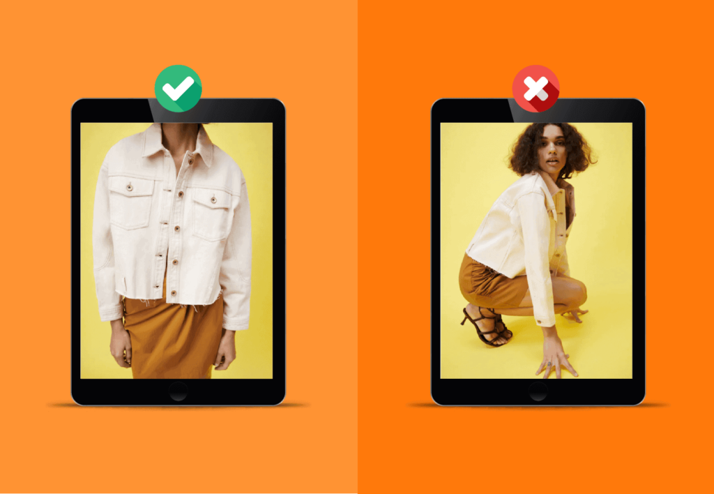
If you visit their app, it is also off. Here you have to scroll horizontally instead of vertically when you want to see different product images.
It is normal user behaviour that you will automatically swipe right or left when you want to see more of a product.
I always end up landing on a different product, and after about five attempts I close the app and open another one where I can spend my money faster.
If you need more than just my bad experiences to convince you, google “Zara UX” and see what comes up 😅
What is good UX?
Good UX focuses on understanding the user’s needs, wishes, and expectations, and then designing and delivering a solution that meets these requirements in an intuitive and satisfying way.
This involves careful research into the user’s behaviour, preferences, and context to create a user-friendly and effective experience.
UX design also focuses on visual aesthetics and interaction design to ensure users have a pleasant and intuitive experience.
This involves choosing appropriate colours, typography, layout, and interface elements that align with the user’s expectations and provide a cohesive experience across different devices and platforms.
So what should your thought process be to achieve good UX?
Your first thought should be: “how do our visitors use our site?”. Open your site in a browser or app, close your eyes and, in true “Men in Black” style, erase your memory of your site. Now try navigating your site.
Be highly critical. Does it feel natural when you need to find products, contact information, or other important things that should be completely straightforward? If not, you need to adjust your UX.
Any unnatural thought quickly becomes an obstacle for your visitors, and it can cost you dearly, as they will leave your site again quickly.
If, on the other hand, you have a list of 20 features that need to be available within a small area, it is important that you prioritise which ones matter most. If possible, you should “kill your darlings”, but it does not always have to go that far.
Shall we take a really good example of great UX? ✨COOLSHOP ✨
Of course we should.
Coolshop is a clear winner when it comes to great user experience. It is not a fancy solution that promises the moon, but a solution that shows the products, explains how they are used, and tells you both what the items used to cost and what the current price is.
You do not have to calculate percentages or look for yellow stickers. You might be thinking, “I have seen this before, but not at Coolshop” then it is probably Amazon.
The two websites are almost identical, and we all know they are both doing quite well 😉

Can you see what I mean? 👇

Remember: The user experience does not always have to be fancy. It is your visitors who need to be satisfied!
The better the experience for your users, the greater the likelihood that they will use your website again and that is, of course, the goal.
Let us keep it short and sweet;
What does Coolshop do that Zara fails to do?
- Easy to find products – great flow😎
- Easy to see prices with contrast and colours 💸
- Simple design 🔥