
Digitalization
23. November 2023
What is responsive design?
It is a term that covers all the measures you can take on a web platform (website, webshop, intranet, etc.) to ensure it “works” on all screen sizes. “Works” in the sense that the site visually adapts depending on the size of the screen it is accessed from.

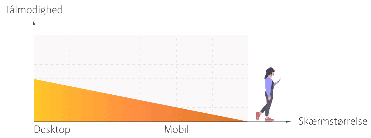
When you think responsively, you start from the most commonly used screen sizes, so it is not a given that the experience is 10/10 on ALL screen sizes.
In this post, I will share my advice and recommendations for responsive design.
Can I adapt the responsive design to all screen sizes?
Yes, that would be the utopian goal but it becomes expensive, as both a designer and a developer would need to design and code every conceivable type of view. This would certainly not be our recommendation.
Instead, you should ask: “Does it really add enough value to develop a solution that costs 40–50% more, just to improve the experience for the last 5–10% of your web traffic?” most of the time, the answer is a loud and resounding NO.
Our advice is therefore that you should instead check which screen sizes your visitors use most often, and then focus your responsive design efforts on those.
Who can make something responsive?
It is a developer’s job (i.e., someone who can code) to make the website responsive. A designer can “only” show what things should look like at the different screen sizes, but it is the developers who ensure the website adapts technically.
However, it is a good idea to visualise what the view should look like on mobile and desktop, so the developer can see how things should be coded to adapt in the best way.
So the bad news is that it is not something you can do yourself without a development background.
Basic responsive measures
Now that you cannot code responsive design yourself, what can you do? Quite a lot you can be mindful of several things and hold your developers accountable for them.
Below are the most common and basic responsive measures you should have implemented.
Dynamic font sizes
Make sure your fonts automatically adapt to the screen size. It should be coded so that the website itself “calculates” what the font size should be, depending on the screen size.
For example, if your body text is set to 16px on a 24″ screen, the website should detect the visitor’s screen size and adjust the font proportionally, based on how large their screen is as a percentage relative to a 24″ screen.
Try out our 5 recommended font families
The width of text fields
The size and most importantly the width of your text fields matters, especially on smaller screen sizes. If you have very wide text fields, you will find that on mobile they create a “wall of text”, because all that wide text suddenly has to fit into a space 10 times narrower, turning the text into a veeeeery long scroll.
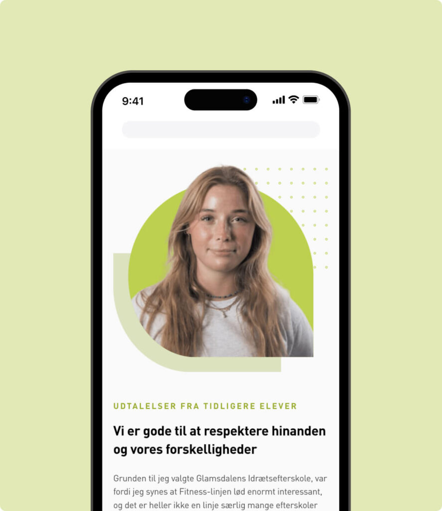
Image style, size and placement
Both when choosing an image style and the overall size of your images, you need to consider whether large images work well on smaller screen sizes, and whether you can still see what is happening in the image if it loads very small.
Alternatively, you can code it so that one image is shown on mobile and another on desktop to provide the best experience for both. As long as you do not hide text from desktop to mobile, search engines will be happy.
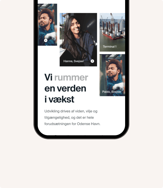
Finally, pay attention to image placement. For example, if an image sits next to text, or you have a mosaic of images in a row, you need to consider how they will stack on mobile so you do not end up with a long row of images on mobile, or an image appearing before the text in a way that makes the images less meaningful.
Everything must fit on the screen
You must not have an experience on any screen size that requires zooming in or out to see all the content. The layout must accommodate all content at 100% zoom.
How elements “stack” in relation to each other
On small screen sizes, you cannot avoid stacking your elements on top of each other. The default behaviour in most CMSs is to stack things in reading order from left to right.
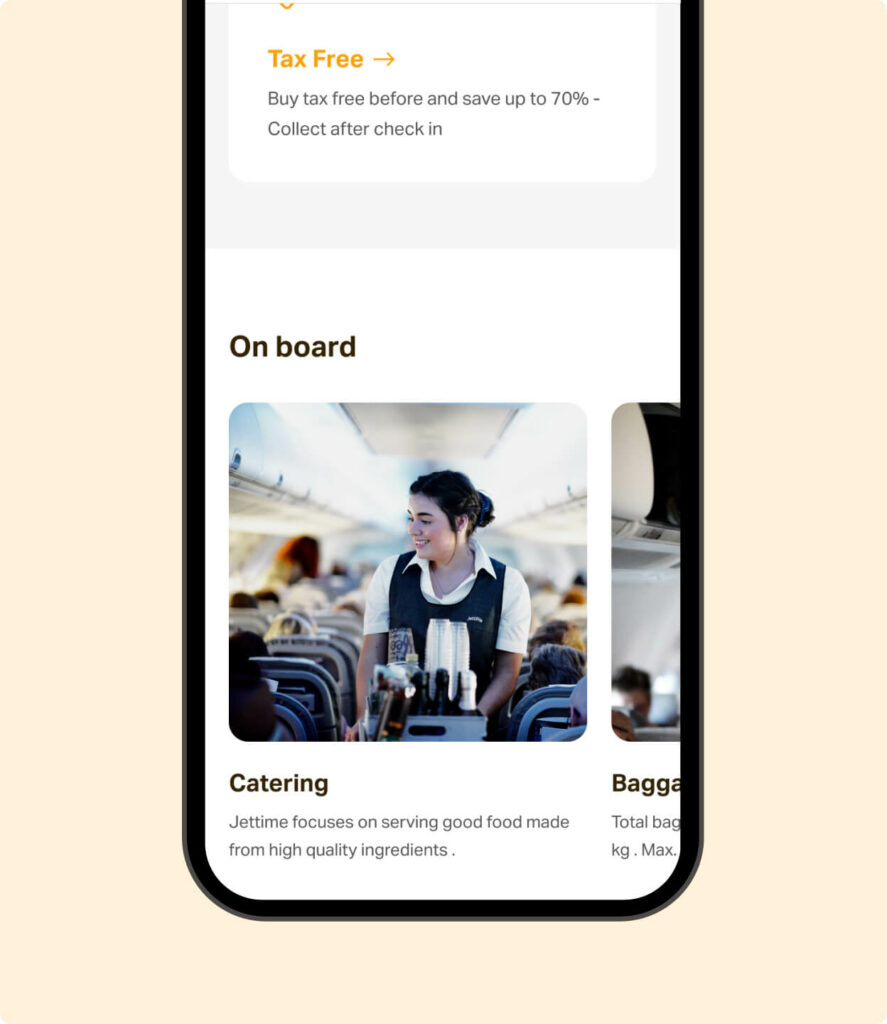
That can also provide an okay experience, but you risk some things stacking in a way that creates a long and boring scroll for example, suddenly getting 3–4 images in a row, or 7 customer logos in stripes down the page.
You can use horizontal scrolling to create a rightward scroll for certain content types, providing a smoother and more appealing experience within the vertical scroll, so users continuously encounter new content types instead of “waterboarding” your visitors with the same type of content page.
Adapting navigation for smaller sizes
Make sure your navigation (main menu) works on smaller screen sizes. For example, you often see the menu collapse into a “burger menu”, as these are quite user-friendly on mobiles and tablets.
Also, make sure the menu items are large enough to tap with a thumb.
Our advice for responsive design
- CTA buttons should be full width on mobile to make them easier to tap with your thumb.
- Important buttons such as the ‘burger’-menu should be placed in the right corner of the screen, as this aligns with most users’ dominant thumb.
- You can also place the menu at the bottom of the screen.
- Make sure buttons are large enough so you do not accidentally tap two buttons with your fingers.
- Text should be left-aligned on mobile, as it is difficult to read when centred it may be centred on desktop.
- Remember a reader-friendly order when stacking your elements. For example, if on desktop you have a heading, CTA button and a text field in that order within an element, then on mobile the order should instead be: heading, text field, and CTA last, so the button does not interrupt reading.
- For some content, it makes sense to allow horizontal scrolling for example, if you have content with many examples (cases, logos, employees). That way, instead of a long scroll of cases, users can scroll right to see more cases, and otherwise scroll down to see other content.
Remember that responsive design improves your user experience, which can improve your search engine rankings, while an improved user experience can increase your conversion rate.
So not only does responsive design make your users happier, it can also bring you more traffic and more leads or sales from that traffic so it is a no-brainer: you should and must invest in responsiveness.
And if you are ready for mobile optimisation, read the blog post with 3 good tips on how to avoid losing mobile users on your website.